
Most readers here will be familiar with the issues surrounding western blotting as a technique in the bio-sciences, namely it is highly amenable to fabrication and inappropriate manipulation. A quick glance at PubPeer, ScienceIntegrityDigest, ForBetterScience, and other blogs reporting on scientific misconduct, makes it clear that blot-fakery is alive and well in 2020. Today, I will walk you through a paper I received for review which takes this to a whole new level!
What’s the problem?
One of the most common problems encountered with western blot data, is the presentation of “letter-boxed” blot images such as the one shown here…
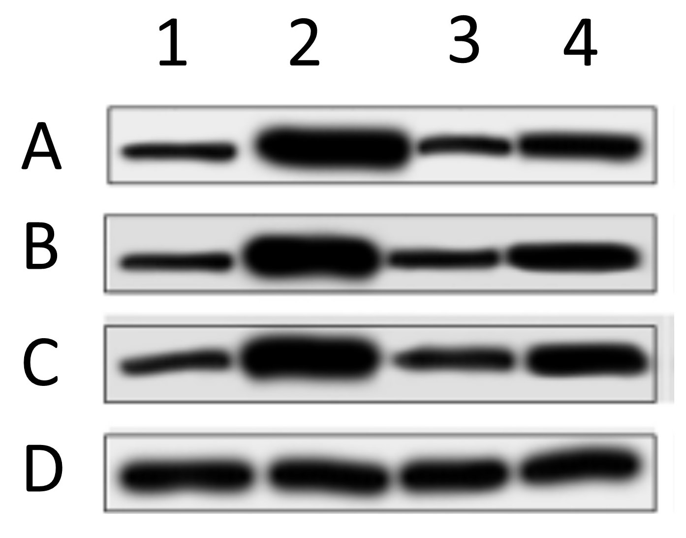
In this image, 4 different proteins (ABCD) are blotted under 4 different experimental conditions (1234). These types of image are problematic for several reasons. First, there are no molecular weight (MW) markers, so it’s impossible to tell if the antibody recognized a protein at the correct MW. Second, only a small vertical slice of gel is shown, so it’s impossible to tell if the antibody only recognized one protein or several bands (how specific was the Ab). Third, in these types of collages the bottom blot (D in this case) is typically the “loading control”, showing the abundance of a house-keeping protein such as GAPDH or beta-actin, thus allegedly proving that equal protein was loaded in each lane. The problem is, as you can see from the example above, the spacing, size, shape, and slope of the bands is different in each blot. This makes it clear that the “loading control” likely did not originate from the same blot membrane – the authors simply loaded a different gel and blotted that, so this is not a true loading control. Fourth, western blotting as a method suffers from a woefully narrow dynamic range (about 10-fold), so it’s important for quantitation purposes that the bands be exposed somewhere within that range. Here, all of the bands have solid black centers and are overexposed, so the bands are completely useless for quantitative purposes. Lastly, the background (more on that in a minute) is plain and washed out, so it’s impossible to “anchor” the bands to any background features. This makes it impossible to tell if any of the bands have been pasted or spliced together. It doesn’t mean the image is fake, it just means it’s impossible to say it’s not fake.
When I receive a paper to review, if the bulk of data is presented in this letter-boxed format, I will often reject the manuscript, or demand better quality evidence.
How have publishers reacted to the blot-fakery crisis?
In recent years, many journals have become aware of the shit show that is blot-fakery, and have started to demand better quality controls for submitted manuscripts. This typically requires provision of full-sized, uncropped blots as original images. Since most journals are online and storage is not an obstacle, this is now easy for authors (of authentic work) to comply with. Many publishers are going a step further and demanding complete original data sets behind every figure! My lab has been doing this for a while now, posting complete data sets on the file server FigShare.
How have faking authors responded?
One might think that simply demanding better quality original data would solve the blot-faking crisis, but no. What if the “original” blot images can be faked? That’s what I found today while reviewing a paper for a UK based journal.
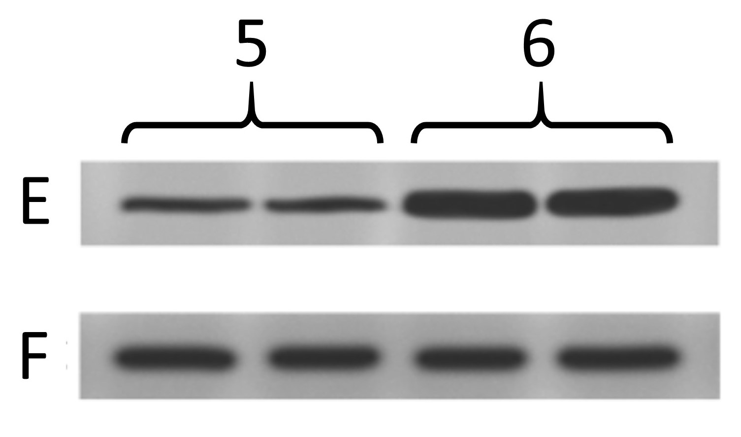
Below are the two blots as presented in the paper. The one on the left is the same as at the top of this post, and was from cells treated with 4 different drug conditions. The other one is from cells treated with 2 different genetic manipulations (5, 6) and blotting 2 more proteins (E, F) where F is the “loading control”.
Now, below are the “original” blot images whence (allegedly) these letterboxed blots came. On the left, the 4 blots that make up the first panel, and on the right the 2 that make up the second panel. At first glance, this seems like the epitome of data transparency; beautiful full-sized gel images with lovely backgrounds, and band patterns that clearly match up to the images used in the panels for the final paper.
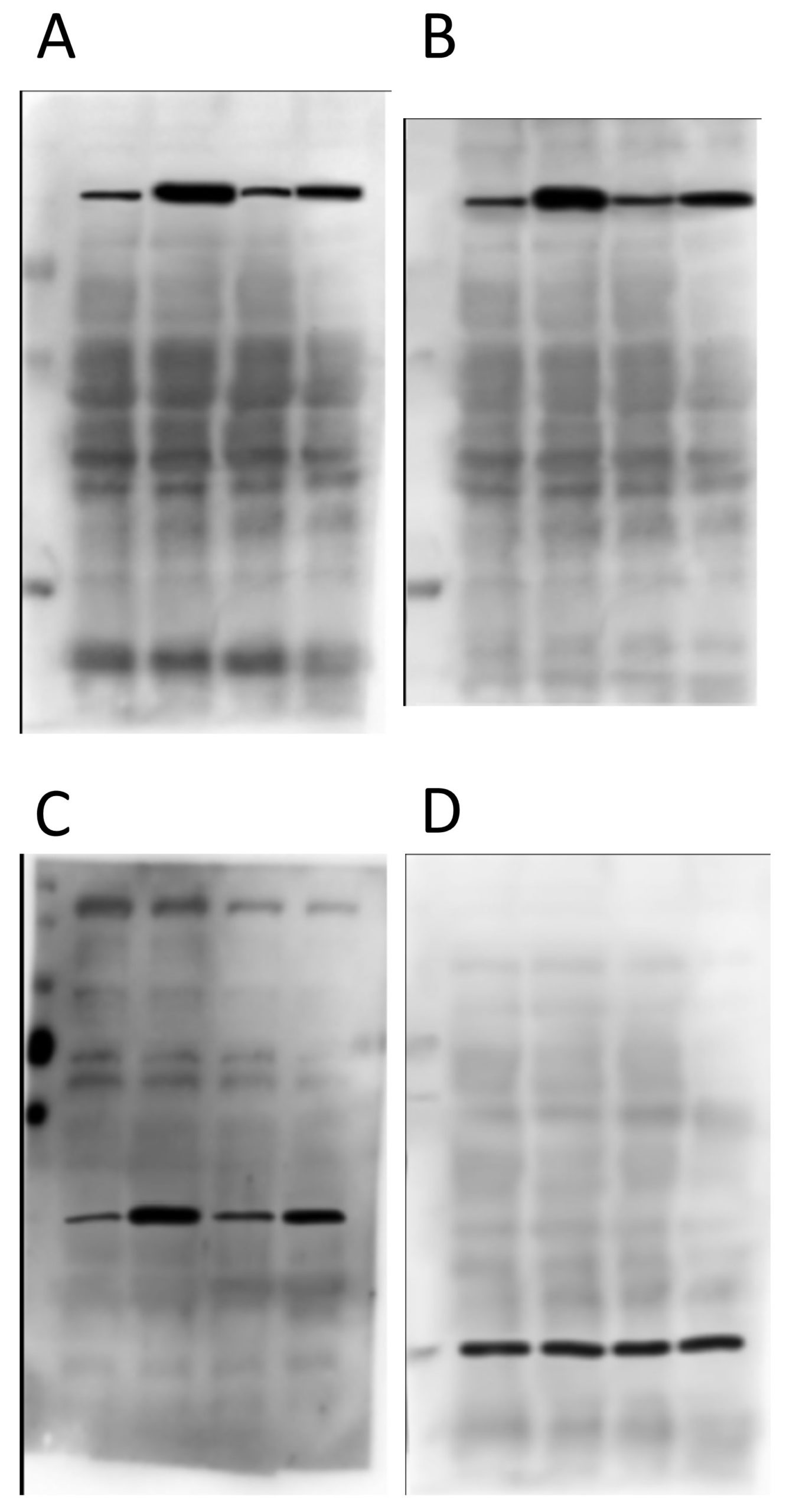
So what’s wrong? Let’s take a look at panels A and B first…

As you can see from the red boxes and the blue arrows, there are several features shared between these 2 background images. What makes this interesting is that protein A and protein B are of a very similar molecular weight – it’s quite common to strip and re-probe a blot using a different antibody, or to cut up a membrane and probe for several proteins at once, but to blot for 2 proteins at an almost identical molecular weight is almost impossible to pull off. The other weird thing is that the horizontal width of some of the bands appears to have been adjusted between these blot background images (e.g. the material in the 3rd lane appears wider in B than in A, as if it’s been stretched).
Next up, proteins C and D from the first panel…

There’s nothing particularly egregious about this pair. It is clear they’re from different gels/membranes due to the different backgrounds, which is a good thing. BUT… the protein in D is the “loading control”, and so is meant to come from the same membrane. Ergo, this is not a true loading control – they just loaded the same samples on a different gel. Lots of people do this and it’s not good.
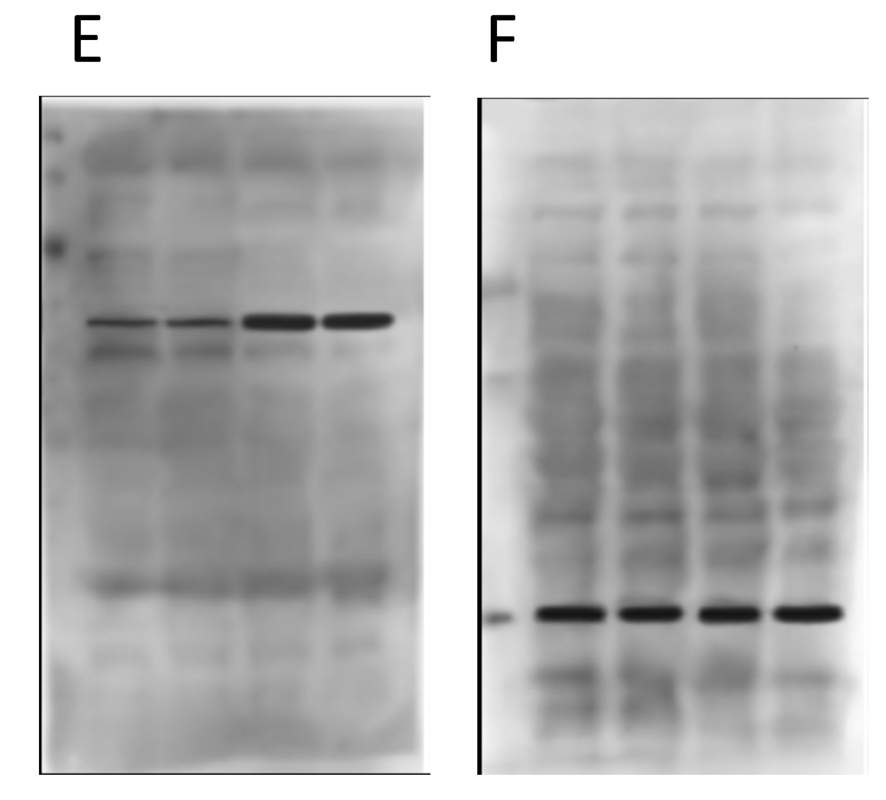
Now onto the proteins E and F in the second panel…
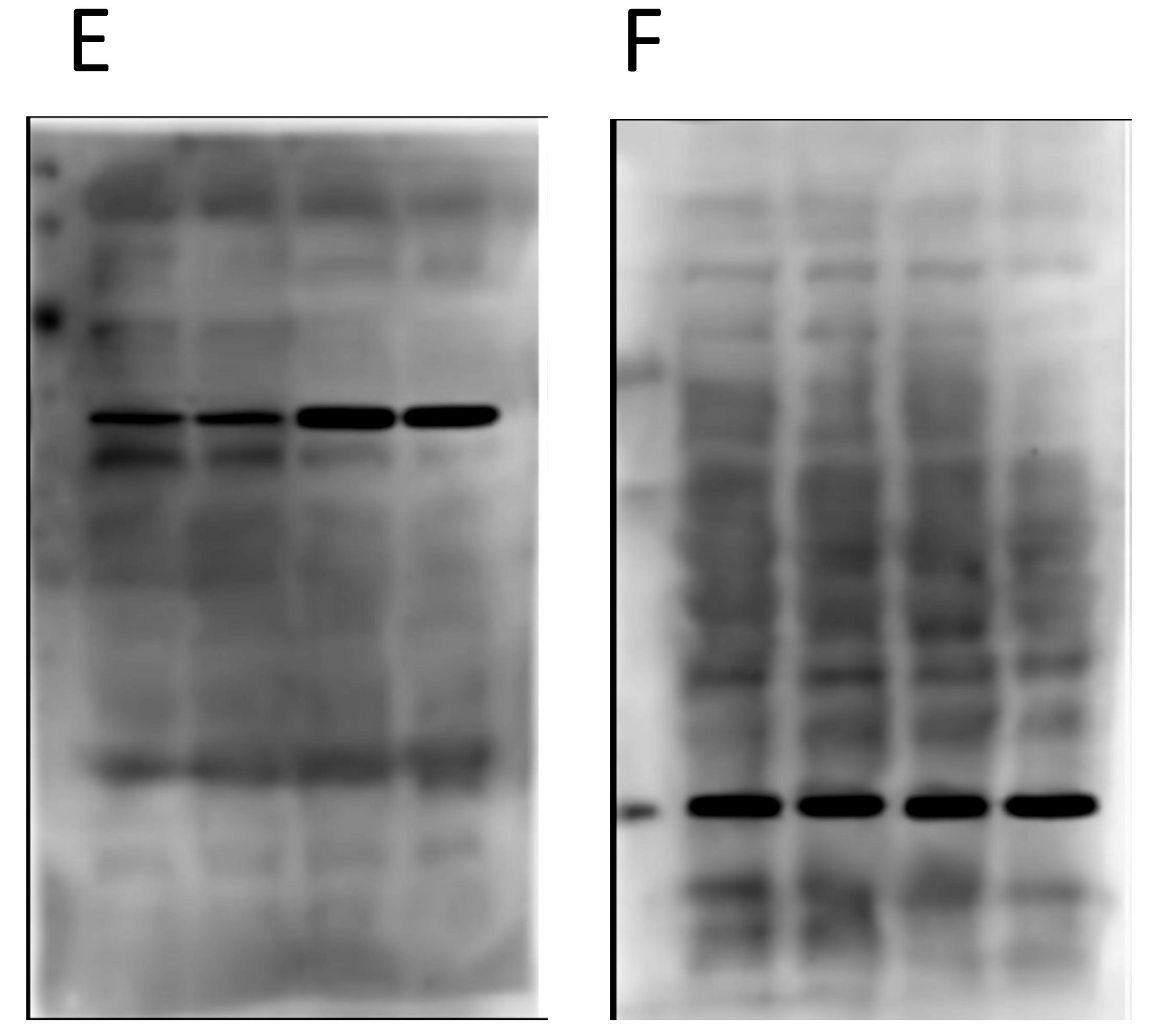
Again, nothing particularly egregious here. Different proteins, different blot images, different backgrounds. But again, F is the loading control protein, so they should have been blotted/probed on the same membrane. Not using proper “loading controls” doesn’t adhere to best practices.
So what’s the big deal?
Things start to get real interesting when we compare the backgrounds of the “original” blot images from the two different panels. Remember, in the original paper the 4 blots A/B/C/D were from cells treated with drugs, and the 2 blots E/F were from genetically manipulated cells. Completely different experiments – no way the blots can be the same right? Right…
Obviously there’s been some re-sizing, and they’re not identical, but as the colored boxes show there are a number of very coincidental similarities between these two background images, onto which the black bands for the proteins of interest seem to have been teleported. There are also some funny shadow lines above the black band of interest in the right hand image (E) which may be indicative of splicing.
Furthermore, when we compare the images for panels D and F, i.e. the two loading controls from the completely different and unrelated experiments, there are also common features on the blot backgrounds…
There are differences, but there are more similarities than would be expected by chance, if these two “original blot images” really originated from completely different experiments.
So what can we do about it?
First to summarize, a detailed analysis of the backgrounds for the “original blot images” provided for this paper does not instill any confidence in the integrity of the data. It appears as if the proteins of interest (solid black bands) have been pasted onto background images, to “generate” original blot images.
In terms of what can be done about this type of data fakery, one answer is posts like this, to highlight the problem to journal editors. Even in our new-found utopia of data transparency and open availability of “original” data, authors continue to dupe reviewers and editors, so we need to be increasingly vigilant.
Another solution is to name and shame. Unfortunately this would be problematic on several counts. The journal review process is private, and if I were to reveal the name of the journal they would probably demand I take down the above images since they were provided to me in confidentiality. For this reason, I removed any identifying labels about the proteins. It would also not be particularly fair on the authors for their work to be thrown into the court of public opinion before it has had a chance for proper peer-review.
In this case, I rejected the paper and I outlined the reasons why in my review. But, as is usually the case, I expect it will eventually show up published in another journal. This has happened a few times… I call out a paper during review and it shows up later with the offending data removed (or sometimes not) but with the same list of authors, thus indicating the senior author did not wish to punish whomever in their lab did the faking.
So, for now I’ll be watching closely to see if this paper makes an appearance somewhere else, and (naturally) I’ll be paying close scrutiny to the other papers from this group, to see if there are any other shenanigans worth reporting here or on PubPeer. All of this just goes to show that even with enhanced data stewardship approaches, the plague of western blot fakery shows no signs of going away.